
Case studies / Web design
Custom website development · Home careA home care website has two visitors. They want opposite things.
One is a family looking for care. The other is a caregiver looking for work, and in home care, the workforce is what limits how many families you can serve. We built Bonjour Home Care a site that serves both without either getting in the other's way.
Good care, in need of a site that could explain it.
Bonjour Home Care provides non-medical in-home care across New Jersey, including personal care, licensed care, companion care, hourly, overnight and 24/7 live-in support.
Their existing site didn't separate those services clearly, didn't establish credibility quickly, and gave a visitor no obvious next step, whether that visitor was a family or a caregiver.
Careers sits in the main navigation, next to Services.
Most agency websites bury recruitment in the footer, because hiring feels like an internal concern rather than a marketing one. In home care it isn't. An agency that can't staff a case turns the family away, which means the caregiver looking for work and the family looking for care are both, in a real sense, customers.
Anxious, comparing, wants reassurance.
Often an adult child arranging care for a parent, frequently for the first time, unsure what the categories mean or what it costs. They need to know the agency is real, licensed, local, and that someone will answer the phone.
- Entry point Services, Reviews, FAQ
- Needs first Trust
- Converts by Calling
- Decision horizon Days to weeks
Practical, direct, wants the application.
A home health aide comparing agencies on shifts, pay and location. They want to find the careers page in one click and not read anything aimed at families. Making them hunt for it sends them to the agency whose site didn't.
- Entry point Careers
- Needs first The form
- Converts by Applying
- Decision horizon Same day
Good care, unclear online.
Bonjour Home Care provides non-medical in-home care across New Jersey: personal care, licensed care, companion care, hourly, overnight and 24/7 live-in support.
Their existing site didn't separate those services clearly, didn't establish credibility quickly, and gave a visitor no obvious next step.
-
Six service lines that sound alike
Companion care, personal care and licensed care mean specific and different things, and almost no first-time visitor knows which one they need. Presented as an undifferentiated list, they create hesitation rather than clarity.
-
The category itself needs explaining
Families routinely confuse non-medical home care with skilled nursing or a facility. If the site doesn't clarify that in the first paragraph, half the visitors are evaluating the wrong thing.
-
The conversion is a phone call
People arranging care for a parent call. They don't fill in a form and wait. A site optimised around a contact form is optimised for the wrong action.
-
Recruitment had nowhere to go
Caregiver applications are as important to a home care agency as client enquiries, and there was no clear path for them.
Five decisions, visible on the homepage.
Each one is a choice about who the page is for and what it asks them to do.
Lead with the feeling, not the service
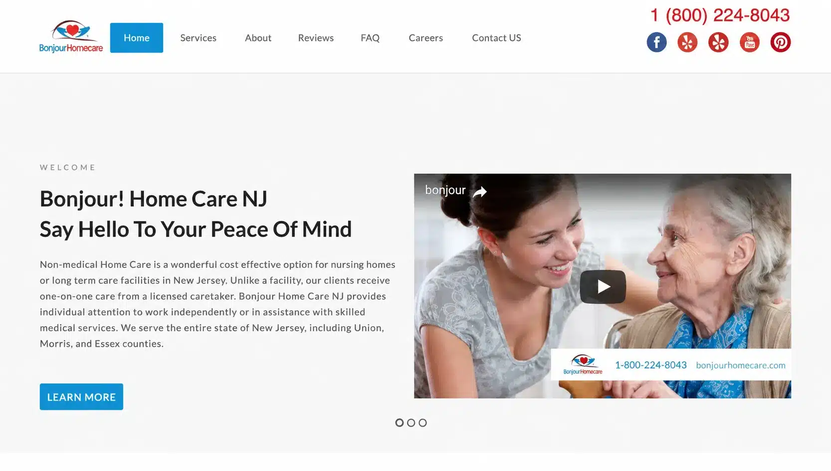
"Say Hello To Your Peace Of Mind." Nobody wants home care. They want to stop worrying about a parent who lives alone. Naming the emotional outcome rather than the service category is what separates a home care headline that lands from one that reads like a brochure.
The headline speaks to why someone is on the page.
Clarify the category in the first paragraph
The opening copy states plainly that this is non-medical home care, positions it against nursing homes and long-term care facilities, and names the counties served. Three jobs in one paragraph: what it is, what it isn't, and whether it's available where you live.
A visitor knows within seconds whether they're in the right place.
Make the phone number impossible to miss
Large, red, top right, above everything else, and burned into the video frame as well, so it stays visible while the video plays. For a business where the conversion is a call from someone who may be upset, the number should never require scrolling or searching.
One number, reachable from anywhere on the page.
Put trust in the navigation
Reviews and FAQ given top-level positions rather than being buried, plus review platform links in the header. Someone deciding whether to trust an agency with a parent's care goes looking for both immediately, and a site that makes them hunt loses them to one that doesn't.
The two pages that answer "are you real" are one click away.
Give caregivers their own door
Careers in the primary navigation alongside Services and About. It costs one nav slot and it means a caregiver never has to read past content written for families to find the application.
Both audiences served without either being the afterthought.
This is a build, not a performance case study.
We designed and developed the site. We're not presenting traffic figures, enquiry volumes or ranking improvements, because we don't have them for this project.
A website case study that claims "improved user experience" and "increased inquiry potential" without numbers behind them is describing the brief, not the outcome. We'd rather show the work and the reasoning.
What's above is what was built and why each decision was made. Whether it produced more enquiries depends on traffic, market conditions and how the agency handled the calls, none of which a website controls on its own.
Where we do have performance data, we publish it. The Anchor Health and Today's Home Care case studies carry full funnel numbers, including the results that didn't go to plan.
Four things for any home care website.
Put careers in the main nav
If your staffing limits how many clients you can take, recruitment isn't an HR page in the footer. It's a second conversion path and it deserves a nav slot.
Name the feeling, not the service
Nobody wants home care. They want to stop worrying. Headlines that name the relief outperform headlines that name the category, in every service where the purchase is reluctant.
Design for the call
If your customers phone rather than fill in forms, the number belongs above the fold, in the header, and on every screen size. Form-first design optimises the wrong action.
Say what you are not
In categories people confuse, non-medical care versus skilled nursing, home care versus a facility, clarifying early saves both sides a wasted conversation.
What went into it.
Six of our services, on one build.
Other home care accounts.
Is your website serving one audience or two?
If your business is limited by the people you can hire as much as the customers you can win, your site probably treats recruitment as an afterthought. Send us the URL and we'll tell you what each audience runs into, and what's getting in the other's way. Findings are yours to keep either way.
No obligation · We'll tell you if it doesn't need rebuilding