
Case studies / Web design
B2B landing page design · White label CBDTheir customer isn't buying CBD. They're choosing a supplier.
American White Label CBD manufactures products other companies sell under their own names. The person landing on their page is an entrepreneur deciding who to trust with their brand. We designed a landing page for that decision: not a shop, a sales conversation.
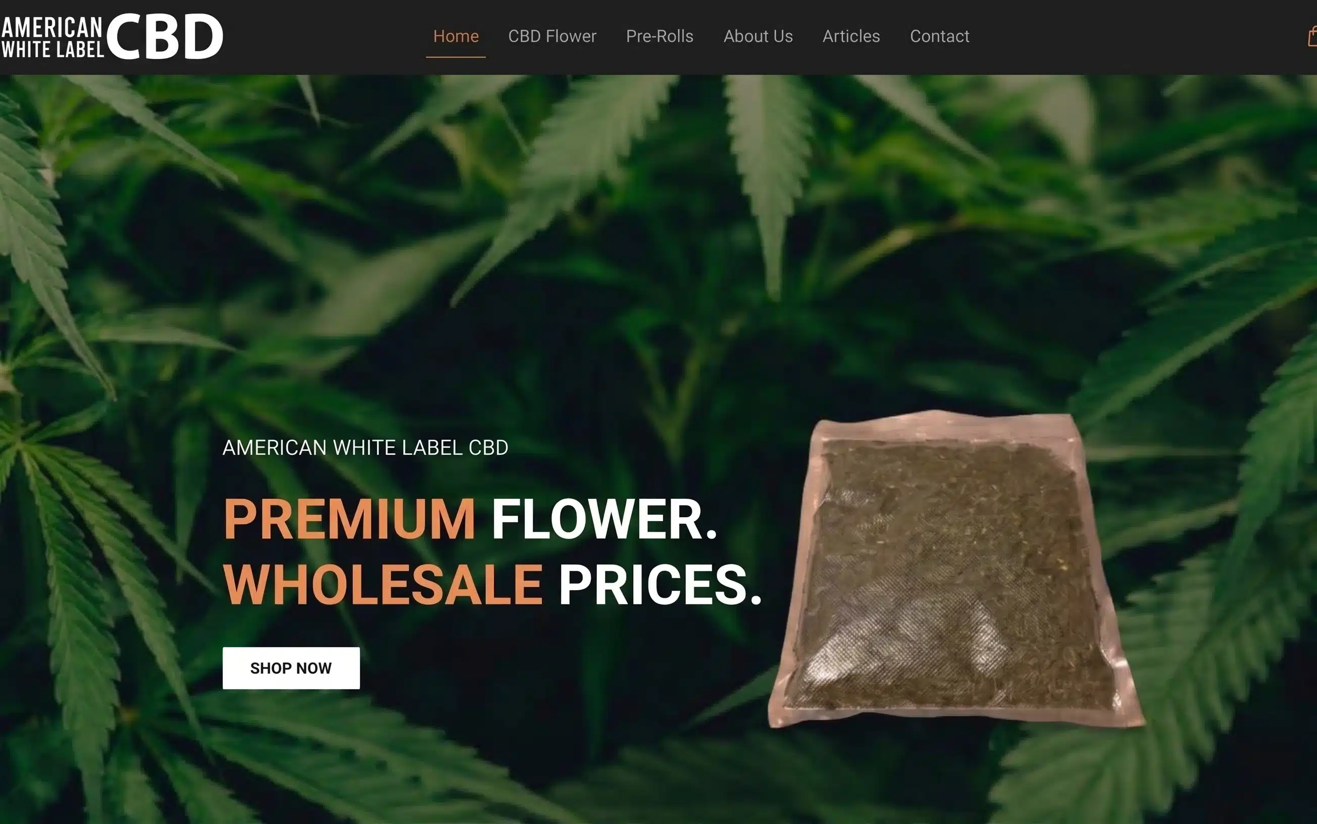
Their customer isn't buying CBD. They're choosing a supplier.
American White Label CBD is a B2B manufacturer producing premium hemp and CBD products for entrepreneurs and brand founders looking to launch under their own names. They partnered with us to design a dedicated high-converting landing page and brand visual system.
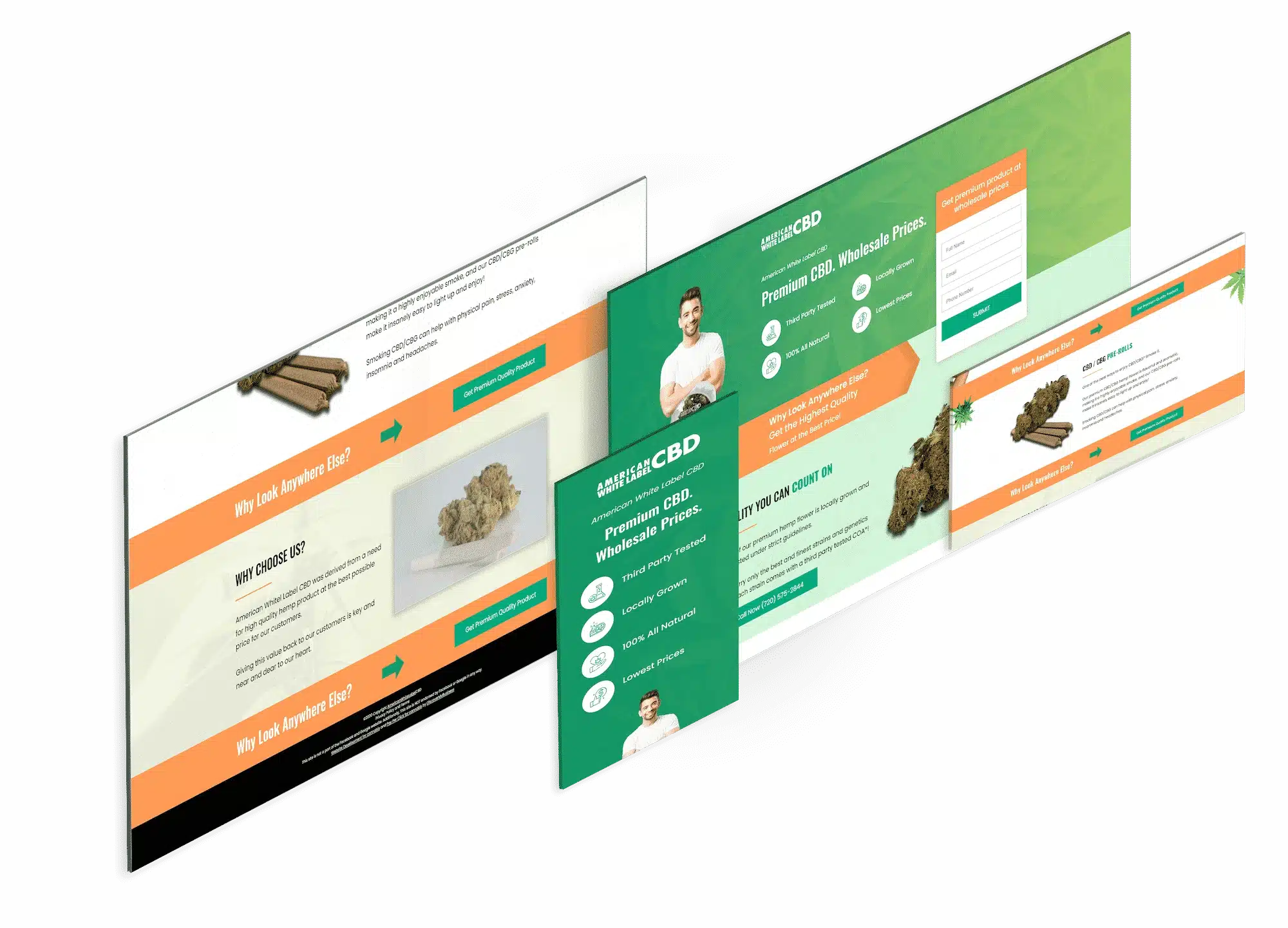
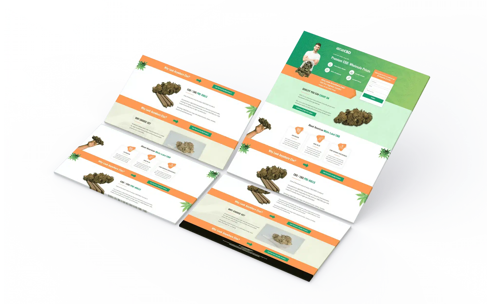
Rather than building a standard direct-to-consumer store, we structured the experience around a B2B sales conversation: establishing manufacturing credibility, illustrating process transparency, and driving high-intent wholesale inquiries.

A consumer buys a product. A brand founder buys a risk.
Someone launching their own CBD line is putting their name on a product they didn't make. If the manufacturer's quality slips, the testing is sloppy or the labelling isn't compliant, it's the founder's brand that takes the damage. So a white-label landing page isn't selling a product. It's answering one question: can I trust you with my company?
Sells the product.
Product imagery, a price, an add-to-cart button. The visitor is deciding whether to try something, and the cost of a wrong decision is one order.
- Visitor End customer
- Decision Try this product?
- Cost of a mistake One order
- Conversion Checkout
Sells the partnership.
Manufacturing standards, testing, formulation options, minimums and process. The visitor is choosing who their brand will depend on, and the cost of a wrong decision is the brand.
- Visitor Brand founder
- Decision Trust this supplier?
- Cost of a mistake Their company
- Conversion A conversation
Four decisions for a B2B buyer.
Each one answers a question a founder asks before they'll pick up the phone.
Four sections, one argument
The page is structured as a sequence rather than a catalogue: what they make, how it's made and tested, what working together looks like, and how to start. A founder evaluating suppliers is building a case for one of them; the page lays that case out in order.
A page that reads like a sales conversation.
Look like a manufacturer, not a shop
A brand style guide and custom icon set give the page the visual register of an established operation. Suppliers who look like a small storefront get treated like one. For a founder handing over their brand, looking like a serious business is a precondition, not a nice-to-have.
Credibility before the first line of copy.
Illustrate the process, not the product
Custom illustrations carry the parts that are hard to photograph and matter most to a B2B buyer: process, stages, what happens between enquiry and delivery. Stock product photography says nothing about whether a manufacturer is reliable.
The how made visible.
A CTA system built for a conversation
Calls to action designed as a consistent system and placed at the points a founder is ready to talk, with an enquiry, not a purchase, as the goal. B2B buyers who aren't ready get pushed away by aggressive CTAs; buyers who are ready need one obvious next step.
One clear next step, when they're ready for it.
This is the design, not a performance claim.
We designed and built this landing page. We're not attaching traffic, enquiry or sales figures to it: the page is about the work and the reasoning behind it.
“Improved engagement” and “reduced bounce potential” describe the brief, not the result. We'd rather show the page and explain why it's built the way it is.
For consumer-facing hemp design, see Travushka. For restricted-category ecommerce with performance data, see King Buddha.
Four things for any B2B supplier page.
Design for the risk they're taking
A B2B buyer is often betting their own business on you. The page has to reduce that perceived risk before it can sell anything.
Show the process
For manufacturers and service providers, how you work matters more than what you make. Make the process visible.
Look the size of the job
Buyers choosing a long-term supplier read visual polish as operational maturity. A storefront aesthetic undersells a manufacturer.
Convert to a conversation
Most B2B pages shouldn't end in a checkout. Design the CTA around the first call, and don't push buyers who aren't ready.
What went into it.
Four of our services, on one build.
Does your page sell the product, or the partnership?
If your buyers are businesses, they're evaluating whether to depend on you. Send us your landing page and we'll tell you where it builds that confidence and where it undercuts it. Findings are yours to keep either way.
No obligation · We'll tell you if it doesn't need rebuilding